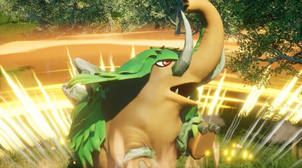
Exploring the latest fan reactions to Palworld’s TCG concept art upgrade reveals a mix of excitement and criticism.
Summary
- Fans critique the font choice and low-res icons in the upgraded art
- Some players appreciate the clear syntax in the card text
Fans’ Excitement
Fans express delight at the improvements in the game’s visuals, calling attention to the intricate details in the artwork that enhance the gaming experience.
Criticism Galore
However, others lament the poor font choice and low-resolution icons that detract from the overall aesthetic, sparking debates on the importance of visual clarity in a TCG.
The Syntax Debate
Discussion ensues over the syntax used in the card’s text, with comparisons to other TCGs like Magic: The Gathering, highlighting the importance of precise wording for gameplay clarity and strategy.
Overall, the fanbase’s reactions to Palworld’s TCG concept art upgrade are a vibrant mix of appreciation and constructive criticism, showcasing the diverse perspectives within the gaming community.


