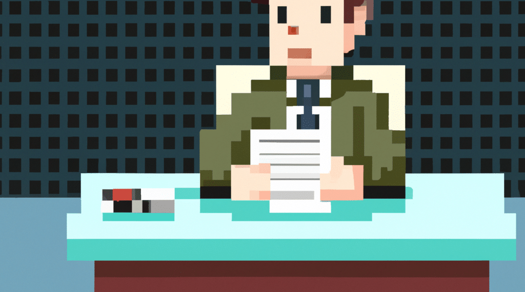
Players in the indie gaming community have recently voiced their opinions regarding the new art style in the upcoming game Parallel Destiny. The developer started with a game jam and will now release an early demo this summer, sparking discussions on Reddit about the changes to the art style.
Summary
- Players appreciate the effort put into both art styles but emphasize the need for better contrast and readability.
- Some users prefer the original art style for its uniqueness and simplicity.
- Feedback indicates a desire for more vibrant colors and distinct features in the new design.
Players’ Opinions
Fans have mixed feelings about the new art style for Parallel Destiny. While some appreciate the more humanoid and serious look, others miss the cuteness and uniqueness of the previous design.
Feedback on Contrast
Several users highlighted the lack of contrast in the new art style, suggesting that brighter colors and sharper outlines would greatly enhance the visual appeal and readability of the characters.
Concerns on Readability
Players expressed concerns about the readability of the in-game sprites, emphasizing the importance of clear silhouettes and defined shapes to help players easily identify and connect with the characters as they move around during gameplay.


